

- Color Theory and Architecture
- How Color Influences Emotions
- Applications of Color Theory in Design
- Case Studies of Color Use in Architecture
- Incorporating Color Theory into Your Projects
Color Theory and Architecture
As an architect, one of the most fascinating aspects of design for me is how color plays a pivotal role in shaping the environment. From the moment I started my career, I was captivated by how color could influence the mood, functionality, and overall experience of a space. Color theory, which is the study of how colors interact and how they can be used in design, has become an essential tool in my work. I’ve come to understand that it’s not just about choosing colors that look good together—it's about using color to create spaces that feel right for the people who use them.
In this article, I’ll dive into the impact of color theory on architectural design. We’ll explore how colors can affect emotions, the practical applications of color in architectural spaces, and even some real-world case studies. If you’re a fellow designer or just someone interested in how color shapes the spaces around us, this guide will give you valuable insights into incorporating color into your projects.
How Color Influences Emotions
Color has a profound psychological effect on humans, which is something I’ve learned to consider when designing spaces. It’s not just about making a room look aesthetically pleasing—it’s about using color to evoke certain feelings and create the right atmosphere. Over the years, I’ve studied how different colors can influence moods, and I’ve found that understanding these emotional responses can help me design more effective and functional spaces.
2.1. Warm Colors: Energy and Excitement
Warm colors like red, orange, and yellow are known for their ability to stimulate energy and excitement. I’ve used these colors in spaces where I want to create a lively, vibrant atmosphere—like in restaurants, cafes, or gyms. Red, for example, is known to increase heart rate and stimulate appetite, making it an excellent choice for dining areas. Orange is often associated with creativity and enthusiasm, while yellow is linked to happiness and optimism. In my experience, these colors are great for areas where interaction and engagement are important.
2.2. Cool Colors: Calm and Tranquility
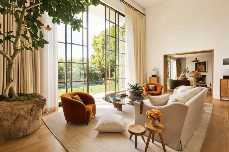
On the other hand, cool colors like blue, green, and purple tend to have a calming and relaxing effect. I’ve used these colors in spaces like bedrooms, libraries, or offices where I want to promote focus, calmness, and relaxation. Blue is particularly effective in creating a sense of tranquility, while green is associated with nature and renewal. Purple can add a touch of luxury and creativity, but it’s often used in a more subdued way in architectural design. In my practice, I’ve found that cool colors work well in spaces that require a calm, peaceful environment.
Applications of Color Theory in Design
Understanding color theory is only the beginning. Applying it effectively in architectural design is what really makes a space stand out. Over time, I’ve discovered several key applications of color theory that I rely on in my projects. Here are some of the ways I incorporate color into my designs:
3.1. Defining Space and Proportions
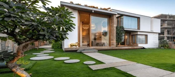
One of the most effective ways I use color is to define the space itself. Color can be used to create the illusion of more space or to make a room feel more intimate. For example, light colors like white, beige, and pastels can make a room feel larger and more open. On the other hand, darker shades like navy or charcoal can make a space feel cozier and more enclosed. I’ve used this technique in small apartments or rooms with low ceilings to create a sense of airiness and openness.
3.2. Accent Colors and Focal Points
In many of my designs, I use accent colors to create focal points and highlight key features. For example, I might paint one wall in a deep, bold color to draw attention to a specific architectural feature, like a fireplace or a statement piece of furniture. This creates a visual balance in the room and guides the flow of movement. Accent colors are also great for adding personality to a space—whether it's a vibrant red chair in an otherwise neutral room or a pop of yellow in an entryway.
3.3. Creating Harmony with Complementary Colors
Complementary colors, or colors that are opposite each other on the color wheel, are another powerful tool I use to create visual harmony. For example, pairing blue with orange or green with red can create a dynamic and visually striking contrast. I’ve used complementary colors in commercial spaces where I want to create energy and excitement, while in residential spaces, I prefer a more subdued approach. Using complementary colors in just the right amounts can add interest to a room without overwhelming the senses.
Case Studies of Color Use in Architecture
To give you a better idea of how color theory can be applied in real-world architecture, let’s take a look at some case studies that demonstrate the impact of color in design:
4.1. The Guggenheim Museum in New York
The iconic Guggenheim Museum, designed by Frank Lloyd Wright, is a perfect example of how color can be used to enhance architectural form. The white exterior of the building contrasts with the natural surroundings, creating a bold and timeless impression. Inside, the use of neutral tones and minimal colors on the walls allows the art collections to take center stage. This design demonstrates how a restrained color palette can let other elements, like art and architecture, shine.
4.2. The Barcelona Pavilion by Mies van der Rohe
The Barcelona Pavilion, designed by Mies van der Rohe, is another excellent example of color’s role in architecture. The use of marble and glass creates a sophisticated, minimalist design that’s still visually impactful. The choice of materials and the subtle color contrasts between the marble, glass, and steel create a sense of balance and tranquility. The pavilion’s design shows how simplicity in color can lead to a timeless aesthetic, creating a harmonious and peaceful space.
Incorporating Color Theory into Your Projects
If you’re an architect or designer, understanding color theory and how to apply it to your projects can significantly enhance the effectiveness of your designs. Here are a few tips for incorporating color theory into your work:
5.1. Study Your Space
Before making any design decisions, I always spend time studying the space. I consider the natural lighting, size, and purpose of the room. By analyzing these elements, I can determine which colors will complement the space and achieve the desired effect. For example, in a room with lots of natural light, I may choose softer, cooler tones to create a serene atmosphere.
5.2. Experiment with Color Palettes
Don’t be afraid to experiment with different color palettes to see what works best. I’ve found that testing out several combinations before committing to a final choice is key. Digital tools like mood boards or color visualization software can help you explore your options. It’s always exciting to see how a small change in color can transform an entire space.
If you’re interested in exploring more about color theory and architectural design, I highly recommend visiting 10 Jay Street for some great resources and inspiration. Their site offers insights into the latest design trends and expert advice on incorporating color theory into architectural projects.